Đề bài, bài mẫu IELTS Writing Task 1 Line Graph phù hợp với band 7+
Một số bài mẫu IELTS Writing Task 1 Line Graph phù hợp với band điểm 7.0+ được biên soạn bởi thầy cô giáo tại hạng A, đạt điểm số 8.0+ Overall giúp bạn tham khảo trong quá trình tự ôn luyện IELTS Speaking tại nhà. prepedu.com chúc bạn học luyện thi hiệu quả và chinh phục được band điểm thật cao trong kỳ thi thực chiến sắp tới nhé!
I. Bài mẫu IELTS Writing Task 1 Line graph - Bài số 01
1. Đề bài
The charts below show the changes in ownership of electrical appliances and amount of time spent doing housework in households in one country between 1920 and 2019.
[caption id="attachment_13026" align="aligncenter" width="692"]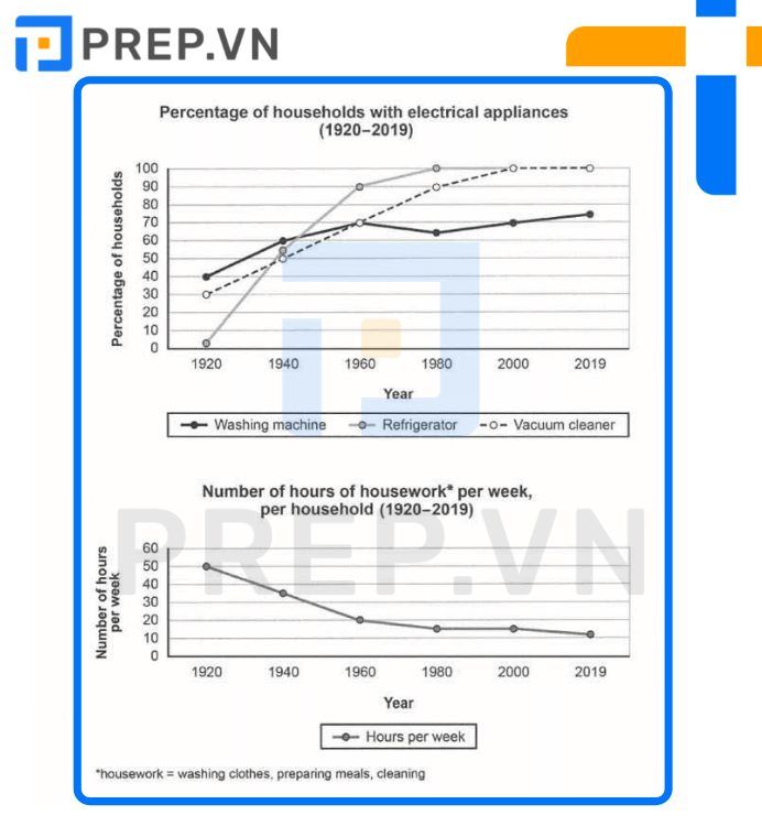 Bài mẫu IELTS Writing Task 1 Line Graph: Electrical Appliances[/caption]
2. Bài mẫu IELTS Writing Task 1 Line Graph: Electrical Appliances
Between 1920 and 2019, the line graphs show how household ownership of various electrical appliances and time spent per week doing housework in the country changed. According to the first graph, the proportion of households that own these devices has increased over time, with every family owning both refrigerators and cleaners by 2019. The most significant change - vacuum overall was observed between 1920 and 1960; whereas the proportion of households with fridges increased markedly from nearly none to 90%, the proportion of households with washers and vacuums increased more- modestly, both reaching 70%. Following that, ownership of refrigerators reached 100 percent in 1980, and ownership of 1960 washing machines followed in 2000. Following that, ownership of 1960 washing machines was acquired. Vacuum cleaner ownership fell to around 65 percent in 1980 before recovering and reaching a high of 75 percent in 2019.
Tham khảo thêm bài viết:
- Cách viết dạng Graph with a trend/ Line Graph trong Writing Task 1
- Tuyển tập từ vựng Line Graph trong IELTS Writing Task 1 thí sinh cần nắm vững!
II. Bài mẫu IELTS Writing Task 1 Line Graph - Bài số 02
1. Đề bài
The graph below shows the number of enquiries received by the Tourist Information Office in one city over a six-month period in 2011. Summarize the information by selecting and reporting the main features and making comparisons where relevant.
[caption id="attachment_13028" align="aligncenter" width="720"]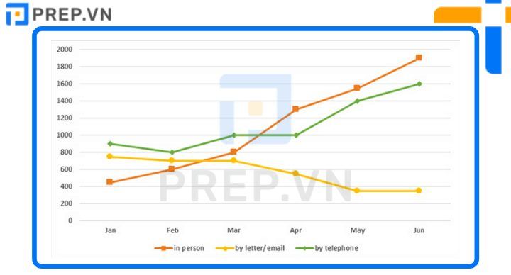 Bài mẫu IELTS Writing Task 1 Line Graph: Enquiries received[/caption]
2. Bài mẫu IELTS Writing Task 1 Line Graph: Enquiries received
During the first six months of 2011, the line graph compares the number of questions received by one particular Tourist Information Office via three different channels: telephone, letter/email, and direct communication. Overall, the office received significantly more inquiries via phone and directly from tourists, as opposed to a gradually declining preference for mailing platforms over the time period provided.
Tourists called the office with about 900 questions, which was the highest number in January. This figure then fell by 100 in February and March before rising to 1000 in March and April, followed by a sharp increase to around 1600 inquiries in June. Similarly, the number of in-person inquiries increased the most, from 450 to 1900, making face-to-face communication the most common method of obtaining travel information.
The trend in written inquiries was the polar opposite. After remaining relatively stable at around 700 questions for the first three months, the number dropped to just 350 questions in May and June.
III. Bài mẫu IELTS Writing Task 1 Line Graph - Bài số 03
1. Đề bài
The graph below shows the number of overseas visitors to three different areas in a European country between 1987 and 2007. Summarise the information by selecting and reporting the main features, and make comparisons where relevant.
[caption id="attachment_13029" align="aligncenter" width="728"]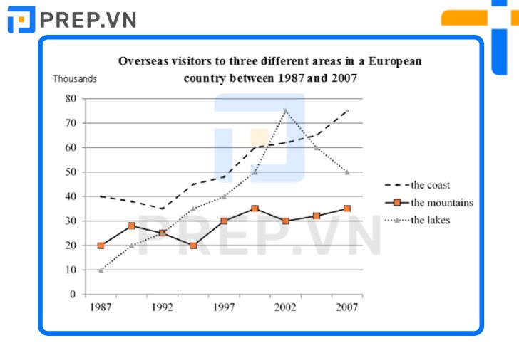 Bài mẫu IELTS Writing Task 1 Line graph: Overseas visitors[/caption]
2. Bài mẫu IELTS Writing Task 1 Line graph: Overseas visitors
From 1987 to 2007, the line graph compares the number of foreign visitors to three different types of natural landscapes in a specific European country over a 20-year period.
While foreign visitors to the coast and mountains increased significantly, the number of tourists to the lakes increased less dramatically, with wild fluctuations over time. Except for the year 2002, the coast was always the most popular destination for visitors.
The coast attracted a total of 40 thousand visitors in 1987. By 1992, the figure had dropped to around 35 thousand, before rising to around 75 thousand in 2007.
Starting at only ten thousand (participle), the number of visitors to the lakes soared to 75 thousand in 2002, when the lakes surpassed the coast in popularity, before plummeting by 25 thousand the following year.
The number of people living in 'the mountains' fluctuated wildly before stabilizing at around 35 thousand in 2007. In 1992, both the mountains and the lakes attracted an equal number of foreign visitors.
IV.Bài mẫu IELTS Writing Task 1 Line Graph - Bài số 04
1. Đề bài
The graph shows the value in US dollars (in millions of dollars) of investment in funds of four categories from 1988 to 2014.
[caption id="attachment_13030" align="aligncenter" width="512"]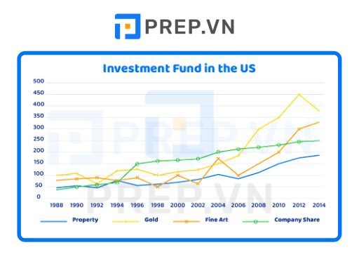 Bài mẫu IELTS Writing Task 1 Line graph: Investment fund the US[/caption]
2. Bài mẫu IELTS Writing Task 1 Line graph: Investment fund the US
Between 1988 and 2014, the line graph depicts the amount of money invested in four financial assets: property, gold, fine art, and company shares. Millions of dollars are used to measure units.
All four types of investment funds clearly increased during the time period shown. Gold was the most dramatically increased among them. In 1988, about $50 million was invested in real estate and company stock, while $75 million was spent on fine art and $100 million was spent on gold. The value of a fine art investment fluctuated over the next 18 years. In contrast, property investment increased slightly (about 100 million dollars), while company shares and gold attracted significant investment interest, with both figures exceeding 200 million dollars.
Gold was the most heavily invested asset from 2006 to 2014, reaching a high of 450 million dollars before falling, followed by fine art, which steadily increased from 100 to around 325 million dollars. In comparison, the value of a company's stock and property has only increased by about $50 million since 2006.
V. Bài mẫu IELTS Writing Task 1 Line Graph - Bài số 05
1. Đề bài
The chart below shows the average cost of the monthly contracts for four different mobile (cell) phones in a European country from January to September 2022, measured in euros.
[caption id="attachment_13031" align="aligncenter" width="760"]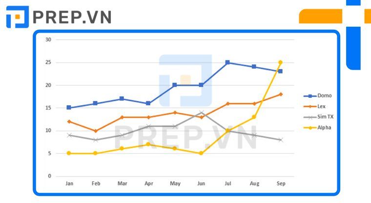 Bài mẫu IELTS Writing Task 1 Line graph: Cost[/caption]
2. Bài mẫu IELTS Writing Task 1 Line graph: Cost
Between January and September 2002, the line graph depicts changes in monthly payment plans for four different European mobile phone brands. While the average monthly cost of Domo, Lex, and Alpha increased to varying degrees over time, with the most dramatic change occurring in Alpha company, the figure for Sim TX remained relatively stable. It is clear that those who used Domo phones had to pay the highest monthly fee.
Customers who used Domo had erratic mobile costs ranging from €15 to €25, with the highest point occurring in July. After paying a manageable €5 on average for mobile services in the first six months, Alpha phone users were hit with skyrocketing costs in the last four months, reaching over €25 in September, a fivefold increase from June. The cost of mobile contracts for both Sim TX and Lex was comparable from January to June, with an overall upward trend reaching the same figure of around 14 euros in June. After that, Lex's price steadily increased to €17, while Sim TX's price dropped to only €9 in September.
VI. Lời Kết
Với những bài mẫu IELTS Writing Task 1 Line Graph trên đây các bạn đã học được thêm phần nào từ từ vựng, cấu trúc ngữ pháp cũng như dàn ý để viết dạng bài Map để áp dụng được cho bản thân mình? Nếu các bạn muốn Prep hướng dẫn bạn thêm phần nào về IELTS Writing thì đừng ngần ngại để lại comment của bạn dưới bài viết này nhé!
Các thầy cô luôn đồng hành trong quá trình luyện thi ielts cùng bạn

Chào bạn! Mình là Hiền Hoàng, hiện đang đảm nhận vai trò quản trị nội dung sản phẩm tại Blog của website prepedu.com.
Với hơn 5 năm tự học các ngoại ngữ như tiếng Anh, tiếng Trung và ôn luyện một số kỳ thi IELTS, TOEIC, HSK, mình đã tự đúc rút được nhiều kinh nghiệm để hỗ trợ hàng nghìn người đang gặp khó khăn trong việc học ngoại ngữ. Hy vọng rằng những chia sẻ phía trên sẽ giúp ích cho bạn trong quá trình tự ôn luyện thi hiệu quả tại nhà!
Bình luận
Nội dung premium
Xem tất cảLộ trình cá nhân hoá
Có thể bạn quan tâm
Kết nối với Prep

MSDN: 0109817671.
Địa chỉ liên hệ: Tòa nhà Vinaconex, 34 Láng Hạ, phường Láng, TP Hà Nội.
Trung tâm CSKH tại HN: Lô 21 C2 Khu đô thị Nam Trung Yên, phường Yên Hòa, TP Hà Nội.
Trung tâm CSKH tại HCM: 288 Pasteur, Phường Xuân Hòa, TP Hồ Chí Minh
Trụ sở Công ty: Số nhà 20, ngách 234/35 đường Hoàng Quốc Việt, phường Nghĩa Đô, TP Hà Nội.
Phòng luyện ảo - Trải nghiệm thực tế - Công nghệ hàng đầu.
Hotline: 0931 42 8899.
Trụ sở Công ty: Số nhà 20, ngách 234/35 đường Hoàng Quốc Việt, phường Nghĩa Đô, TP Hà Nội.
Giấy chứng nhận hoạt động đào tạo, bồi dưỡng số 1309/QĐ-SGDĐT ngày 31 tháng 07 năm 2023 do Sở Giáo dục và Đào tạo Hà Nội cấp.


