Đề bài + bài mẫu Writing Task 1 Pie Chart chi tiết mới nhất 2024
Pie chart – dạng biểu đồ có hình tròn, được chia thành nhiều “miếng bánh” biểu thị tỉ lệ %. Trong bài viết dưới đây, PREP đã tổng hợp một số bài mẫu Writing Task 1 Pie Chart chi tiết mới nhất năm 2023. Tham khảo ngay bài viết này để ôn luyện thi Writing hiệu quả tại nhà và chinh phục được band điểm thật cao trong bài thi Writing thực chiến bạn nhé!
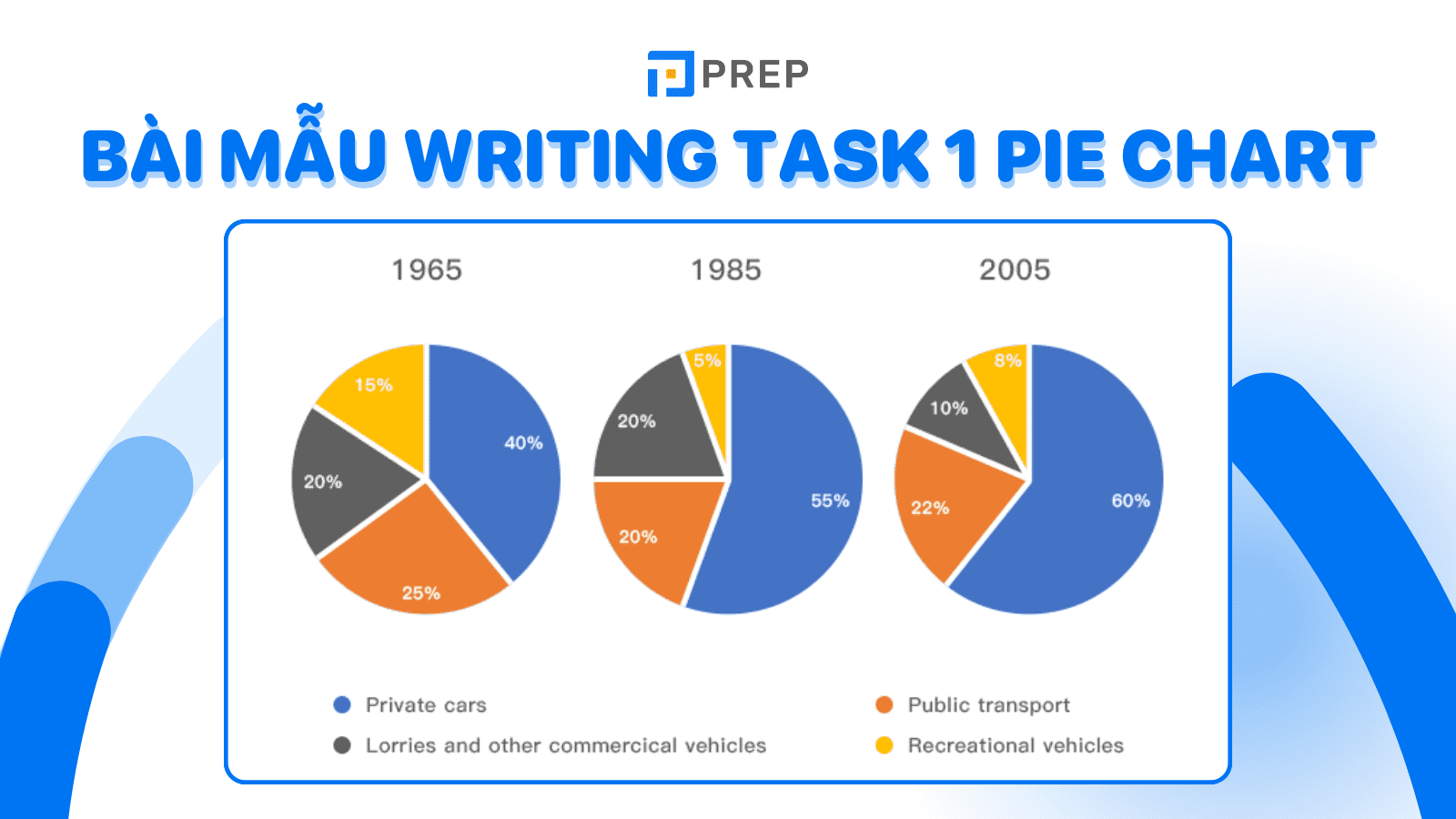
I. Bài mẫu Writing Task 1 Pie Chart - Bài số 01
1. Đề bài
The pie chart shows the amount of money that a children’s charity located in the USA spent and received in 2016.
[caption id="attachment_12918" align="aligncenter" width="512"]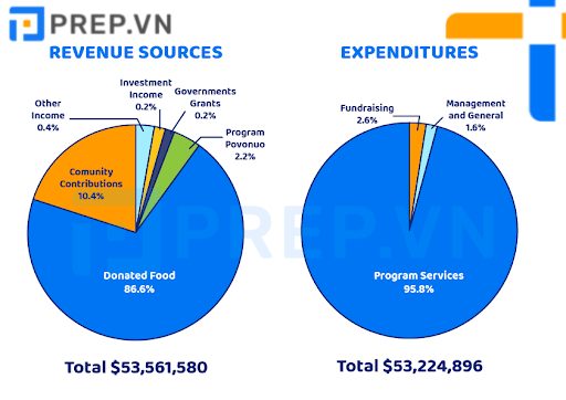 Bài mẫu Writing Task 1 Pie Chart: Money spent and received[/caption]
2. Bài mẫu Writing Task 1 Pie Chart: Money spent and received
The pie charts show how a children's charity in the United States collected and spent its funds over the course of a year. The first chart is divided into six different revenue sources, while the second is divided into three different expenditure purposes.
Overall, it is clear that the foundation obtained the majority of its funds from donated food. On the other hand, it spent the majority of its funds on program services.
To begin, 86.6 percent of revenue for this children's charity came from donated food in a year, which is more than eight times as much as community contributions (10.4 percent). These two income sources accounted for exactly 97 percent of total income. Furthermore, more than 2% of income was lost.
At the same time, the charity had to spend nearly 96 percent of its budget on program services. The remaining 4.2 percent of expenditures were for fundraising, with the remainder going to management and general purposes. It is worth noting that the total income was $53,561,580, which was just enough to cover the expenditures of $53,224,896. By the end of the year, the charity had saved just over $330,000.
II. Bài mẫu Writing Task 1 Pie Chart - Bài số 02
1. Đề bài
The pie charts below show the main regions that receive exports from three Latin American countries in 2004.
[caption id="attachment_12919" align="aligncenter" width="740"]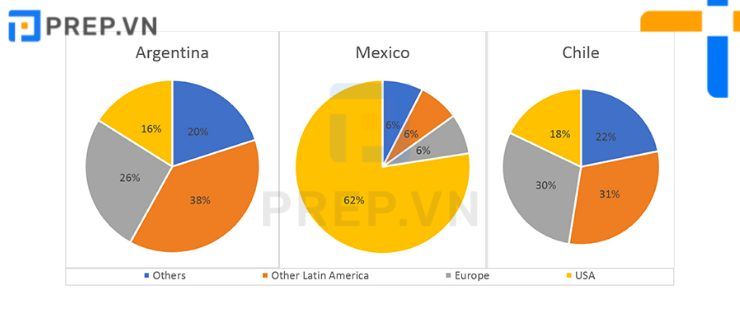 Bài mẫu Writing Task 1 Pie Chart: Receive exports[/caption]
2. Bài mẫu Writing Task 1 Pie Chart: Receive exports
The pie charts depict the various destinations to which Argentina, Chile, and Mexico exported goods and services in 2004.
While the United States was Mexico's most important export market, Argentina and Chile exported the majority of their goods and services to other regions and Latin American countries.
The charts clearly show that the United States accounted for the vast majority (87 percent) of Mexico's exports, compared to only 10% from Argentina and 19% from Chile. In terms of markets in other Latin American countries, the pattern was reversed. Argentina and Chile, in particular, received roughly one-third of their exports from these countries, while Mexico received only 2%. IELTS Although Europe was the second-largest export market for all three countries, there was a significant disparity in the shares, with Chile accounting for 24 percent, Argentina accounting for 18 percent, and Mexico accounting for only 6 percent. Argentina exported the most goods and services to other regions (41 percent), which was double and eight times that of Chile and Mexico, respectively.
III. Bài mẫu Writing Task 1 Pie Chart - Bài số 03
1. Đề bài
The charts show the percentage of people working in different sectors in Townsend in two years 1960 and 2010. Summarize the information by selecting and reporting the main features and making comparisons where relevant.
[caption id="attachment_12920" align="aligncenter" width="533"]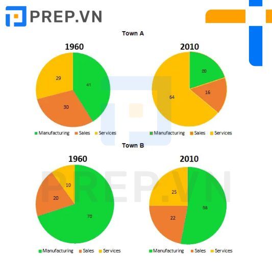 Bài mẫu Writing Task 1 Pie Chart: People working in Townsend[/caption]
2. Bài mẫu Writing Task 1 Pie Chart: People working in Townsend
The pie charts compare the workforce distribution in Townsend in 1960 and 2010 across three different sectors: manufacturing, sales, and services. Over the course of 50 years, employees in both towns became increasingly likely to work in the manufacturing sector. While a similar pattern was observed in town B, the sales sector employed the majority of the workforce.
In 1960, the majority of total employees in town worked in sales-related positions, accounting for 70%, which is 30% more than in town A. Both towns saw a 20% decrease in these figures over the next 50 years. The percentage of manufacturing employees in town more than doubled from 29 percent in 1960 to 64 percent in 2010. A similar trend was observed in town, with the proportion of manufacturing workers increasing from a small percentage (10%) to one-quarter of all workers. In contrast, the service sector in town B experienced virtually no change, with the recruitment of slightly more than 20% of the workforce in both years. However, the workforce employed in this sector has been cut in half, from 30% to 16% in town.
IV. Bài mẫu Writing Task 1 Pie Chart - bài số 04
1. Đề bài
The pie charts below show the results of a survey on the popularity of various leisure activities among European adults in 1985 and 1995. Summarize the information by selecting and reporting the main features, and make comparisons where relevant.
[caption id="attachment_12921" align="aligncenter" width="1920"]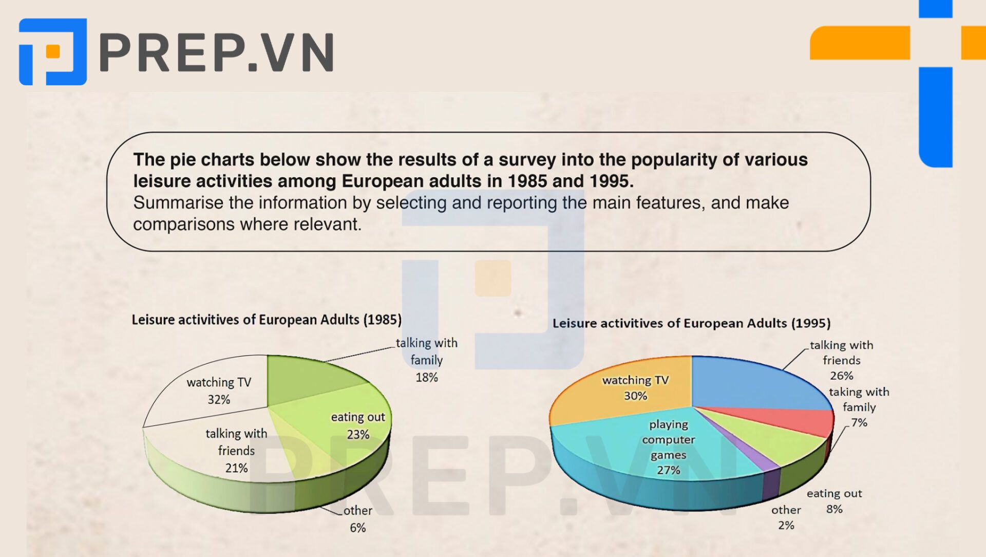 Bài mẫu Writing Task 1 Pie Chart: Leisure activities among European adults[/caption]
2. Bài mẫu Writing Task 1 Pie Chart: Leisure activities among European adults
The two pie charts show how Europeans spent their leisure time in 1985 and 1995.
Clearly, watching television was the most enjoyable activity in both years, at 32% in 1985 and gradually declining to 30% in 1995. The most significant change, however, was the unexpected increase in time spent playing computer games. There was not a single person who stated that playing computer games was their favorite leisure activity, but by 1995, this hobby had grown to 27 percent - the second-highest overall. Talking with friends was slightly lower at 26 percent, up from 21 percent in 1985. However, the number of people choosing eating out as their preferred activity fell dramatically, from a high of 23% to a low of 8%. The same was true for talking with family, which fell from nearly a quarter of the population in 1985 to a mere 7% in 1995.
After ten years, indoor activities had surpassed outdoor activities in terms of time. When watching TV and playing computer games were combined in 1995, they accounted for nearly half of the chart. However, when compared to the first chart, this chart experienced a significant decrease in other types of activities.
V. Bài mẫu Writing Task 1 Pie Chart - Bài số 05
1. Đề bài
The charts below show the percentage of people aged 23-65 in different occupations in one UK town (Ashby) and in the UK as a whole in 2008.
[caption id="attachment_12922" align="aligncenter" width="1338"]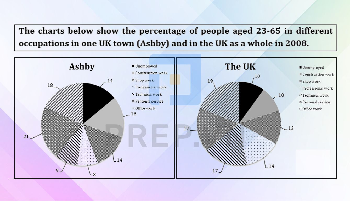 Bài mẫu Writing Task 1 Pie Chart: Different occupations in one UK town and in the UK[/caption]
2. Bài mẫu Writing Task 1 Pie Chart: Different occupations in one UK town and in the UK
The pie charts compare the proportion of people aged 23 to 65 working in six different sectors in Ashby and across the UK in 2008. Overall, it is obvious that the unemployment rate in Ashby was higher than in the United Kingdom. Compared to the average UK workforce, workers in Ashby were more likely to work in the personal service, office, construction, and manufacturing industries.
In 2008, the overall unemployment rate in the UK was 10%, compared to a slightly higher figure of 14% in Ashby. Construction, retail, and personal service employment rates in Ashby were generally higher than the national average, with figures ranging from 13 percent to 21 percent.
Both Ashby and the UK had comparable percentages of office workers aged 23 to 65, with 18% and 19%, respectively. According to national data, the average worker in the UK was twice as likely as their counterparts in Ashby to be employed in technical and professional positions, with proportions of 17% and 14% in the UK versus 9% and 8% in Ashby.
Ngoài việc tham khảo các bài mẫu, bạn có thể tham khảo thêm bài viết "cách viết Writing Task 1 Pie Chart" và "từ vựng Pie Chart" để ôn luyện hiệu quả hơn.
VI. Lời Kết
Trên đây là một số bài mẫu Writing Task 1 Pie Chart chi tiết nhất bạn có thể sử dụng làm nguồn tham khảo hữu ích cho bản thân. Hãy ôn luyện thật kỹ lưỡng nguồn tài liệu này bằng những phương pháp học tập hiệu quả để đạt được mục tiêu mà bạn mong muốn nhé!
Tất cả các dạng bài trên đều có trong khóa học ielts tại Prep. Hãy đăng ký ngay và đồng hành cùng các thầy cô tại Prep bạn nhé

Chào bạn! Mình là Hiền Hoàng, hiện đang đảm nhận vai trò quản trị nội dung sản phẩm tại Blog của website prepedu.com.
Với hơn 5 năm tự học các ngoại ngữ như tiếng Anh, tiếng Trung và ôn luyện một số kỳ thi IELTS, TOEIC, HSK, mình đã tự đúc rút được nhiều kinh nghiệm để hỗ trợ hàng nghìn người đang gặp khó khăn trong việc học ngoại ngữ. Hy vọng rằng những chia sẻ phía trên sẽ giúp ích cho bạn trong quá trình tự ôn luyện thi hiệu quả tại nhà!
Bình luận
Nội dung premium
Xem tất cảLộ trình cá nhân hoá
Có thể bạn quan tâm
Kết nối với Prep

MSDN: 0109817671.
Địa chỉ liên hệ: Tòa nhà Vinaconex, 34 Láng Hạ, phường Láng, TP Hà Nội.
Trung tâm CSKH tại HN: Lô 21 C2 Khu đô thị Nam Trung Yên, phường Yên Hòa, TP Hà Nội.
Trung tâm CSKH tại HCM: 288 Pasteur, Phường Xuân Hòa, TP Hồ Chí Minh
Trụ sở Công ty: Số nhà 20, ngách 234/35 đường Hoàng Quốc Việt, phường Nghĩa Đô, TP Hà Nội.
Phòng luyện ảo - Trải nghiệm thực tế - Công nghệ hàng đầu.
Hotline: 0931 42 8899.
Trụ sở Công ty: Số nhà 20, ngách 234/35 đường Hoàng Quốc Việt, phường Nghĩa Đô, TP Hà Nội.
Giấy chứng nhận hoạt động đào tạo, bồi dưỡng số 1309/QĐ-SGDĐT ngày 31 tháng 07 năm 2023 do Sở Giáo dục và Đào tạo Hà Nội cấp.


