How to write Mixed Charts IELTS Writing Task 1
Mixed Charts IELTS Writing Task 1 presents a complex challenge that demands extensive practice for candidates to excel in the actual examination. This comprehensive guide explores the essential structure and methodology for tackling Mixed Charts tasks, providing practical insights and sample responses to help test-takers achieve exceptional band scores in Writing.
I. Overview of Mixed Charts IELTS Writing Task 1
1. What is Mixed Charts IELTS Writing Task 1?
Mixed Charts IELTS Writing Task 1 comprises two distinct visual representations presenting separate yet potentially related information sets. These charts may share similarities or display contrasting data types. Success in this task requires candidates to synthesize comparative analysis, identify meaningful patterns across both charts, and establish logical connections between the presented data sets.
The complexity lies not merely in describing individual charts but in recognizing the relationship between different visual formats and presenting a cohesive analytical narrative that demonstrates sophisticated data interpretation skills.
2. Common types of Mixed Charts IELTS Writing Task 1
Test-takers frequently encounter these Mixed Chart configurations:
-
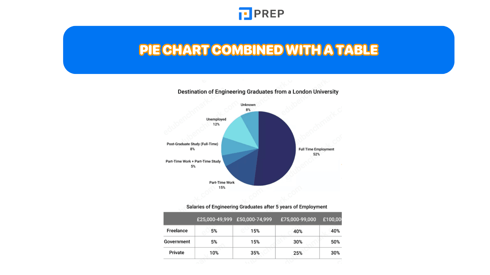
Pie Chart combined with Table data - showing proportional breakdowns alongside detailed numerical information
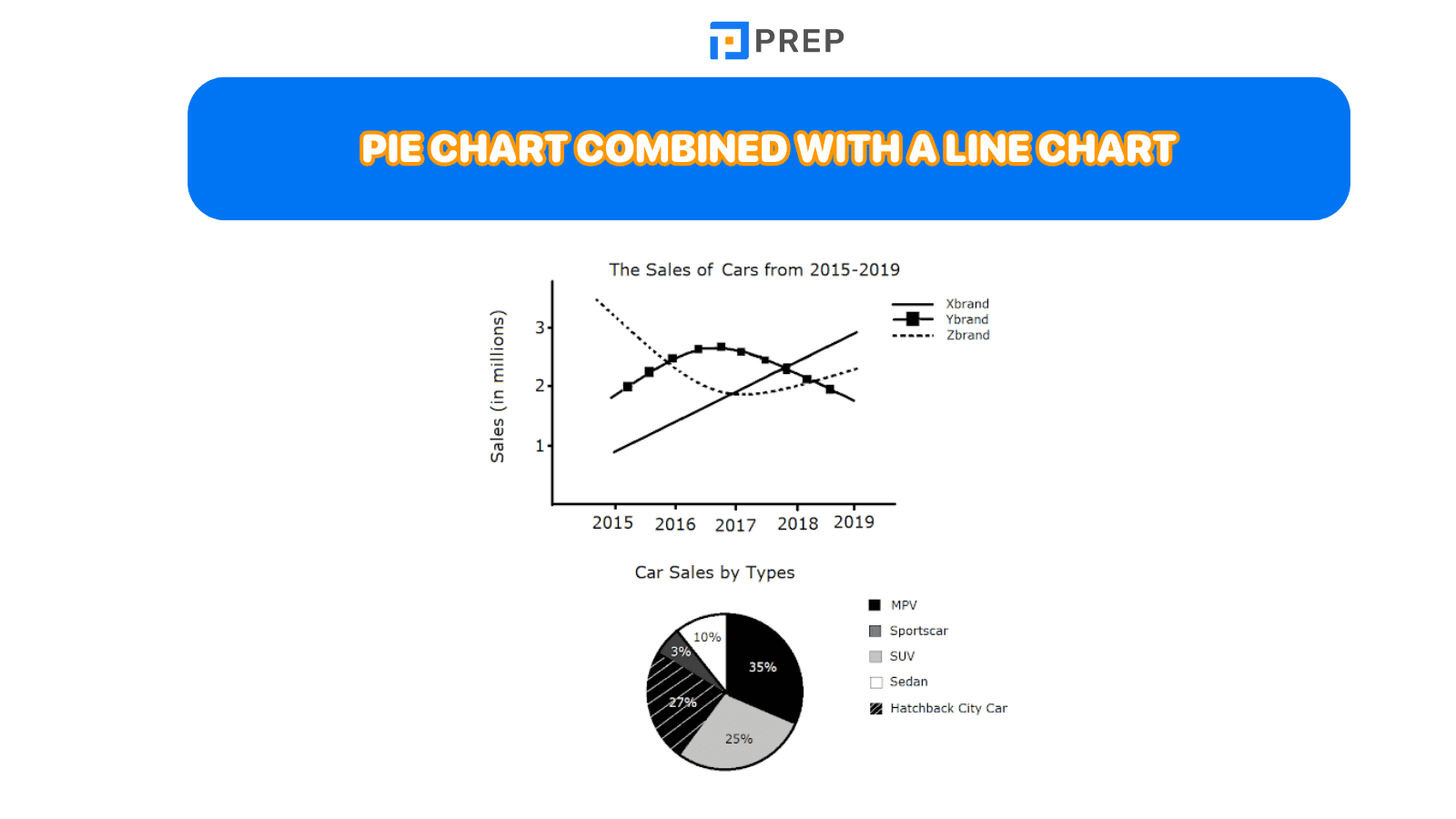
- Pie Chart paired with Line Chart - displaying static proportions against temporal trends
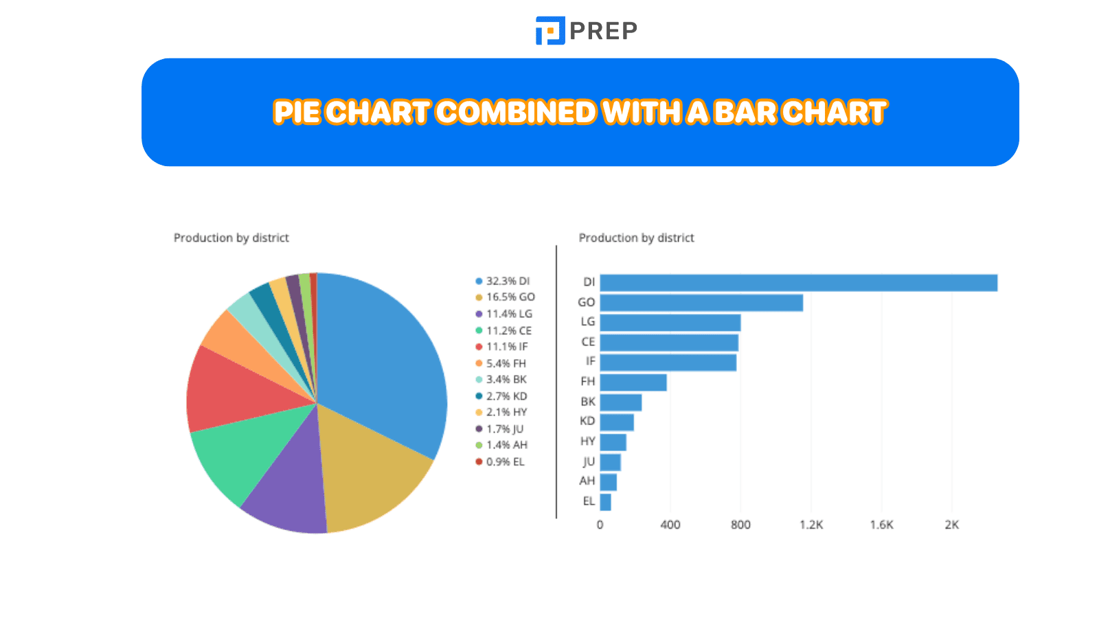
- Pie Chart integrated with Bar Chart - contrasting percentage distributions with categorical comparisons
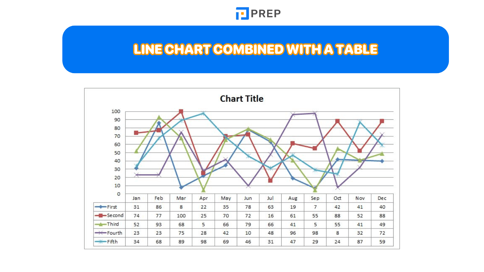
- Line Chart combined with Table - presenting temporal trends alongside supporting statistical data
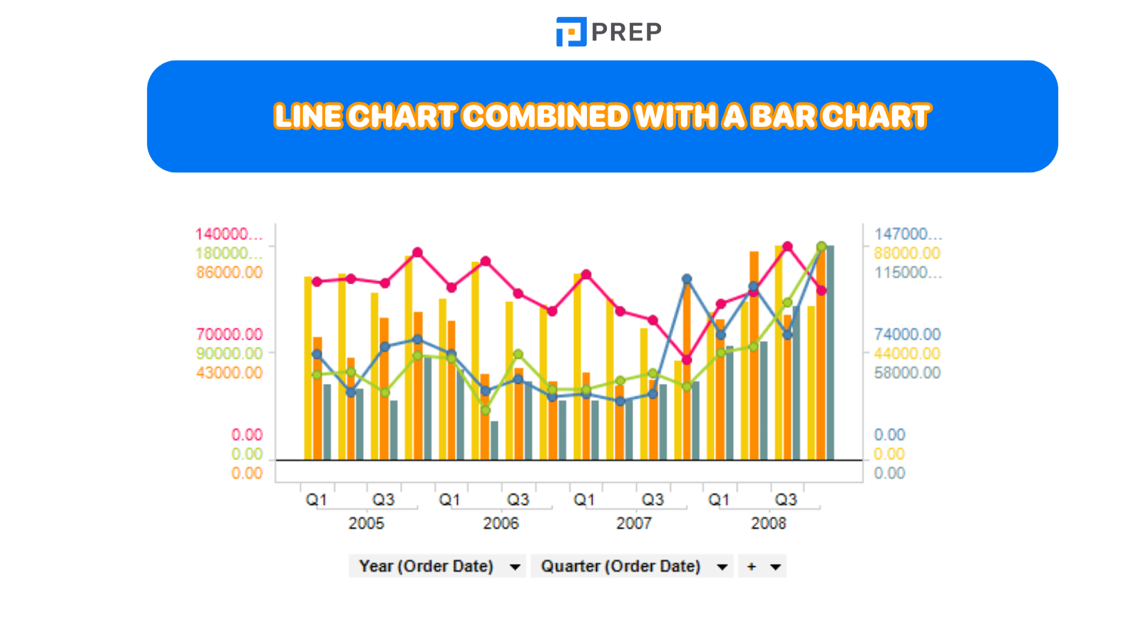
- Line Chart merged with Bar Chart - showing time-based progression with categorical analysis
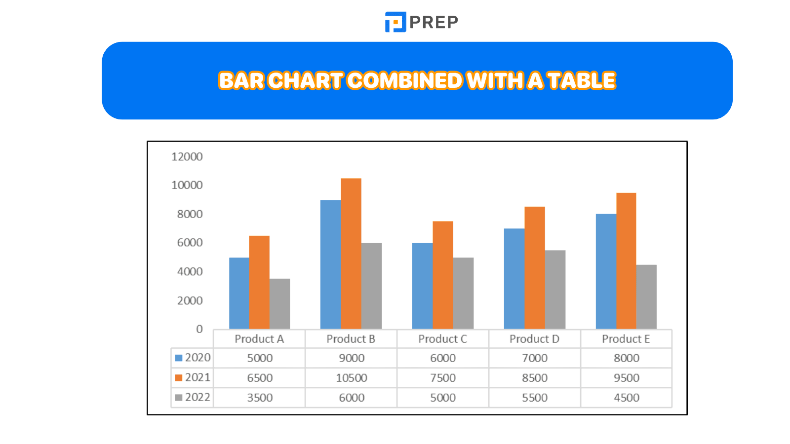
- Bar Chart accompanied by Table - offering categorical comparisons with detailed breakdowns
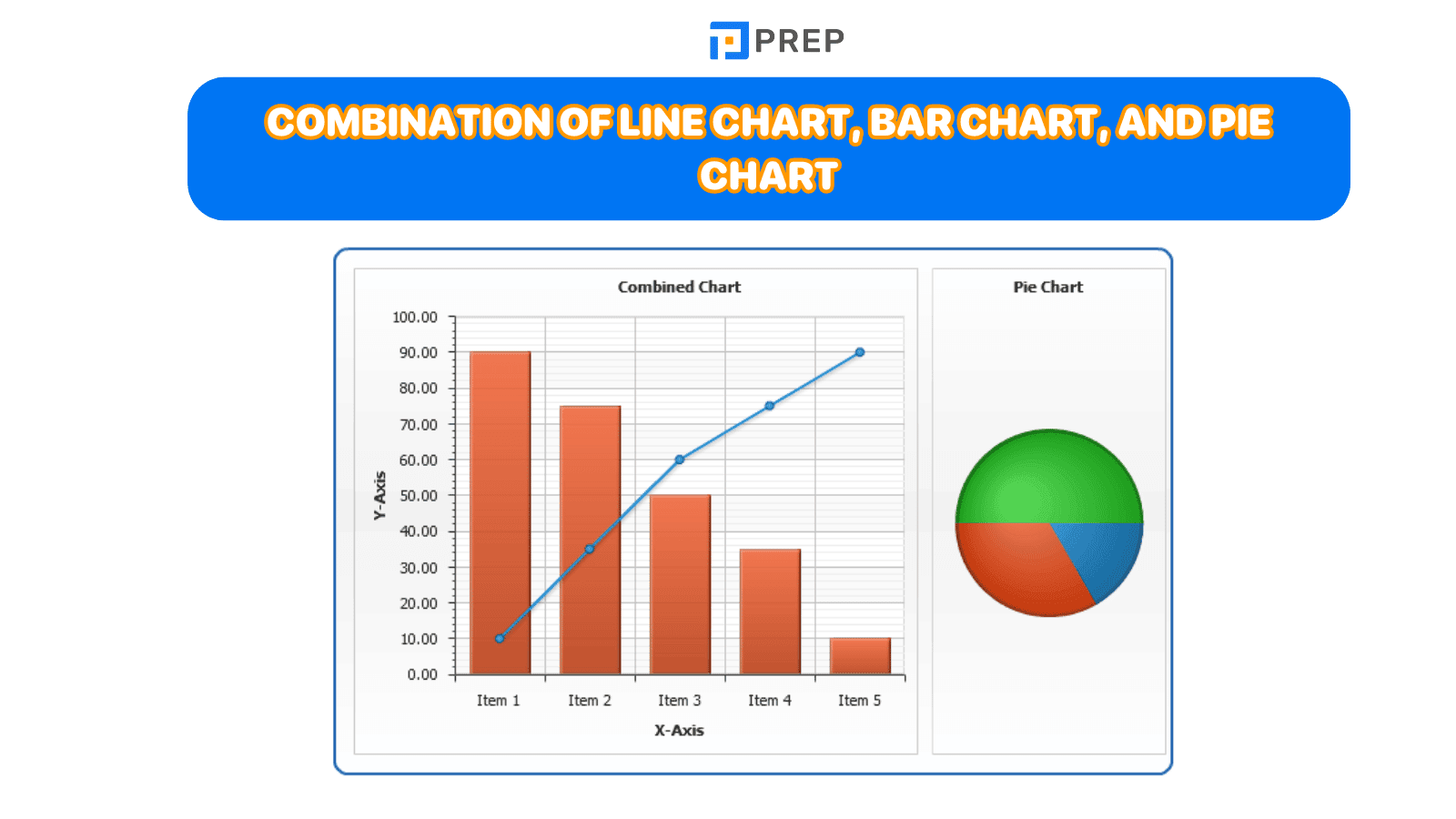
- Triple combination of Line Chart, Bar Chart, and Pie Chart - requiring comprehensive multi-format analysis
3. Vocabulary for describing Mixed Charts IELTS Writing Task 1
-
In the Introduction:
-
Use the Chart title + illustrates/gives information in relation to/provides data about/compares/describes + content.
-
When introducing the two charts, you can use the structure “While/ Whereas S + V, S + V” to show the contrast between the two different types of information.
-
-
In the Overview, you can use phrases such as: It can be seen that/ It is clear that/ Overall,...
-
When referring to each chart in the body paragraphs, you can use phrases such as: Regarding/ With regard to/ Concerning/ As can be seen from/ According to + chart title.
II. Structure of Mixed Charts IELTS Writing Task 1
1. Introduction
Paraphrase the task to provide general information about the two charts.
2. Overview
-
Provide a general comment on the key information of each chart in two sentences. For example, mention the highest/lowest figures, main trends, overall changes in each chart.
-
Grouping the highlighted information by chart will show the corresponding body paragraphs.
3. Body paragraphs
-
Divide the essay into two separate paragraphs to analyze each chart individually. The first paragraph describes the main features of the first chart, while the second paragraph describes the main features of the second chart.
-
The approach of dividing paragraphs based on the two charts is the most common and straightforward. However, if there is a relationship between the data in the two charts, you can choose to divide them based on the relationship between the two types of charts (e.g., dividing them according to the same year).
-
Avoid listing too much information and focus on selecting and describing the most significant information/trends.
III. Effective steps to write Mixed Charts IELTS Writing Task 1
|
Steps |
Details |
|
Step 1: Analyze the question |
Underline or highlight keywords in the task, such as:
➡ Do not choose all aspects and figures from both charts as time and word count are limited (approximately 150 words in about 20 minutes). Try to summarize the main features and make comparisons. |
|
Step 2: Identify the main features of both charts |
Depending on the type of charts given in the task, you need to identify these details for each type:
Once you have a clear understanding of these details from each chart, you are ready to write the Mixed Charts essay for IELTS Writing. |
|
Step 3: Start writing the Mixed Charts essay |
Now it's time to begin writing the IELTS Writing Task 1 Mixed Charts essay, making sure to follow the outlined structure. |
|
Step 4: Double-check your essay |
Avoid losing points due to spelling or grammar mistakes, so make sure to thoroughly check your IELTS Writing Task 1 Mixed Charts essay before moving on to IELTS Writing Task 2. |
IV. Sample essay for Mixed Charts IELTS Writing Task 1
Task: The charts below show the changes in ownership of electrical appliances and the amount of time spent doing housework in households in one country between 1920 and 2019. Summarize the information by selecting and reporting the main features, and make comparisons where relevant.


Looking at the first graph, it is clear that the proportion of households possessing these devices increased over time, with every family having both refrigerators and vacuum cleaners by 2019. The most significant change overall was witnessed between 1920 and 1960; whereas the proportion of households with fridges rose markedly from almost none to 90%, those of households with washers and households with vacuums increased more modestly, both reaching 70% in 1960. Afterward, ownership of fridges reached 100% in 1980, and in 2000, ownership of washing machines followed. Ownership of vacuum cleaners slightly dipped to about 65% in 1980 before recovering and reaching its peak of 75% in 2019.
Contrasting the trend of electrical appliance possession, the amount of time that people spent doing housework shrank throughout the period. The first 60 years saw the most notable decline, from 50 hours per week in 1920 to 15 hours in 1980. Then, following another 20-year period of stability, the number of weekly housework hours fell further to its lowest point of about 10 in 2019.
Key vocabulary and useful collocations:
-
Possess (v)
-
Electrical appliance possession (noun phrase)
-
Rise markedly
-
Modestly (adv)
-
Dip to + data (v)
-
Reaching its peak of + data
-
Shrink (v)
-
Sth. falls further to its lowest point of + data
Grammar structures used:
-
Participial clauses:
-
➡ Looking at the first graph, it is clear that the proportion of households possessing these devices increased over time, with every family having both refrigerators and vacuum cleaners by 2019.
-
➡ Contrasting the trend of electrical appliance possession, the amount of time that people spent doing housework shrank throughout the period.
-
➡ Ownership of vacuum cleaners slightly dipped to about 65% in 1980 before recovering and reaching its peak of 75% in 2019.
-
-
Reduced relative clauses: ➡ Whereas the proportion of households with fridges rose markedly from almost none to 90%, those of households with washers and households with vacuums increased more modestly, both reaching 70% in 1960.
-
Adverbial clauses of contrast: ➡ The most significant change overall was witnessed between 1920 and 1960; whereas the proportion of households with fridges rose markedly.
This analytical approach demonstrates sophisticated understanding of data interpretation and linguistic precision essential for achieving high band scores in IELTS Writing Task 1. The response effectively balances detailed analysis with concise expression, maintaining focus on significant trends while establishing clear relationships between the presented data sets.
Consistent practice with diverse Mixed Chart combinations develops the analytical skills and vocabulary range necessary for examination success. Focus on identifying patterns, making meaningful comparisons, and presenting information through varied sentence structures to demonstrate advanced English proficiency.

Hi I'm Chloe, and I am currently serving as an Product Content Administrator at Prep Education. With over five years of experience in independent online IELTS study and exam preparation, I am confident in my ability to support learners in achieving their highest possible scores.
Comment
Premium content
View all


Personalized roadmap


Most read


UEN: 202227322W
Address: 114 LAVENDER STREET, #11-83 CT HUB 2, SINGAPORE (338729)

